AI data analysis: from a CSV export to a leadership dashboard
Attach an export and ask a question. Bearly runs Python on the file, answers with the numbers, and builds a one-page dashboard you can download or share.

Attach a CSV or spreadsheet to a chat, ask a business question, and Bearly runs Python on the file to work out the answer. Then ask for a Page and it builds a one-page dashboard beside the chat, with tiles, a chart and a summary, that you can download as a single HTML file or share.
Start with the question
Our test file was a year of orders from Quillmoor Cycles, a bike company we made up: 2,273 rows, each with a date, region, sales channel, product category, units and revenue. We attached it and asked Opus 5.5 which region grew fastest from the first quarter to the fourth, and what drove it.
Bearly ran Python on the file twice and answered with a table of quarterly revenue by region. Asia Pacific grew fastest, from $30.5K in Q1 to $58.7K in Q4, up 92%. North America and Europe were roughly flat, and Latin America fell 29%. It then broke down the Asia Pacific gain:
- More orders, not bigger ones. Orders went from 84 a quarter to 147, while the average order grew about 10%.
- Bikes and components. Bikes added $15.7K and components $10.0K.
- Mostly online. The online channel added $17.5K of the $28.2K gain.
We checked each of those figures against the file with our own script, and they match. The reply also raised caveats we hadn't asked for: Asia Pacific is still under a fifth of Q4 revenue, bike orders are large enough to make the category lumpy, and, in its words, "the export can't show underlying causes like marketing or pricing."
Then the dashboard
The next message:
Turn this into a one-page dashboard for our leadership meeting: revenue by region as KPI tiles, the quarterly chart, the top categories in Asia Pacific, and a three-sentence summary. Make it a Page.
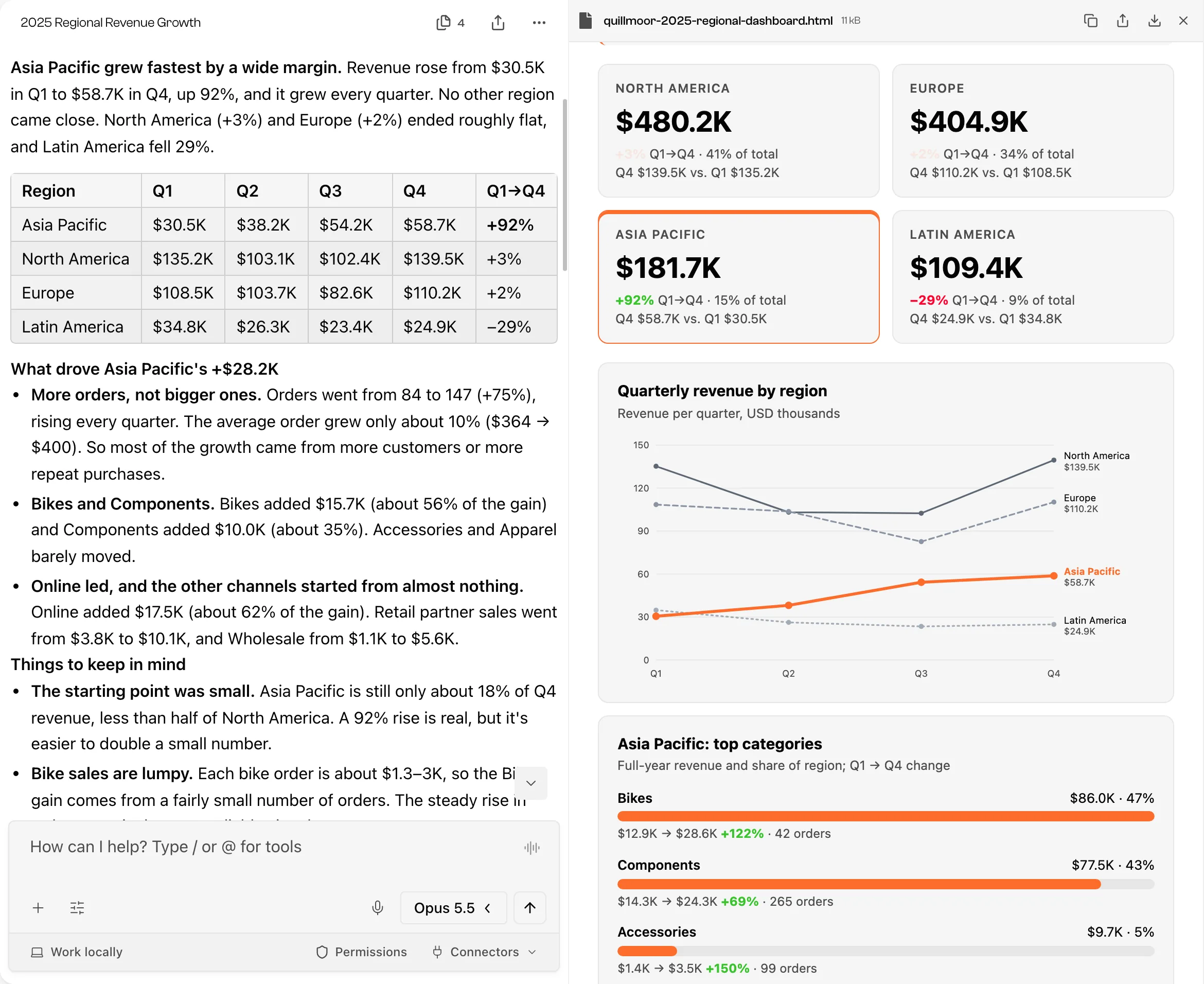
The Page has the summary at the top, a tile for each region with its full-year revenue, share of the total and Q1-to-Q4 change, a line chart with Asia Pacific in orange, and the Asia Pacific categories as bars.
It didn't come out right the first time. In the first version the tiles, the chart and the category panel were blank, because a script the model wrote into the Page failed. We said so in one line ("The chart and the Asia Pacific panel on the Page are blank, and the region tiles are missing. Can you fix it?") and the next version, shown above, has the numbers written into the page itself. A Page is code the model writes, so look at it before you send it anywhere.
Check the numbers
The arithmetic happens in code, not in the model's head. Select a Run Python step to expand the code it ran and the result it got, or ask for the summary table as a CSV and open it yourself.
The numbers on a Page are a different matter. The model copies them in from the analysis, and a copy can go wrong. Ours matched, but compare the tiles with the analysis before you present them. The model's own note said the same thing: it hadn't viewed the rendered page, so check it before the meeting.
Share it
In the open Page, Download saves it as one HTML file that opens in a browser, which is easy to attach to a meeting invite. To send a link instead, select Share in the chat header, then Prepare share. Bearly prepares a readable Page from the conversation, and you choose who can open it before you publish.
The dashboard doesn't update itself. Its numbers are fixed at the moment it was built, so next quarter, attach the new export and ask again.
Limits
- Python runs in Bearly's cloud sandbox, away from your device, with limits on time and memory. Very large files may need to be split into smaller runs.
- The data can show where revenue changed, not why.
- On a team account, admins can turn off Run Python or Pages with a policy.
The Code Interpreter guide and the Pages guide cover both tools in more detail.